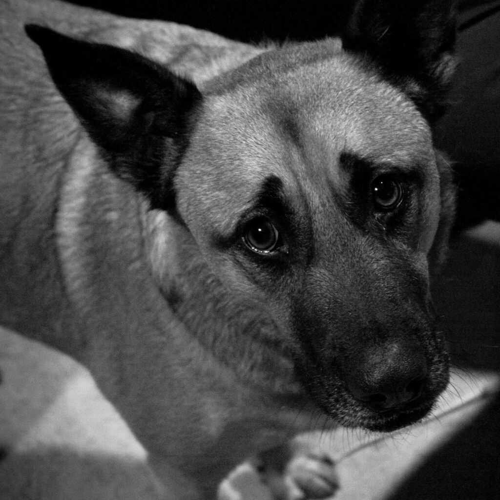
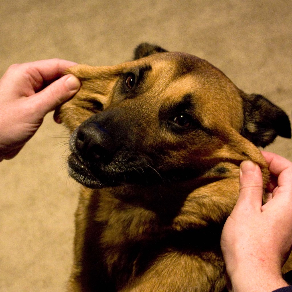
It's been a busy week between work and life and all that stuff. In preparation for their Granny's visit I threw the dogs off track with a mid-week, midday bath. And as a result Lola has been excessively lovey tonight staring longingly into whatever eyes she can capture silently coaxing endless rubs. I always let her roam without her collar for a day or two after her bath. She gets to be naked and we get to do this.
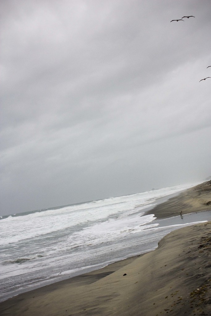
The sea before the storm
It's a wild week of weather and we'll be lucky if California manages to stay in about the same place. It might just wash into the Pacific. Today we are expecting another massive storm with high winds and lots of rain. I had to venture out and see how the ocean was behaving before I hunker down for the rest of the week.
Graphic Design: Coffee and Travel
One of today's design projects was a new yarn label for a fiber called Coffee Beenz. The yarn is intended for adult and sophisticated children's sweaters. A neutral color palette led the way for this coffee house inspired yarn.
To design the label I had to get thinking about coffee. I made myself a cappuccino as inspiration and sat down at my computer to research all things coffee.
I first hit the major coffee house players to see how they are selling coffee these days.

Starbucks, in the upper left hand corner, is clean and stark. I was surprised to find their site so white and so simplified from previous versions. I like it, but it wasn't the warmth I had in mind. Next up was The Coffee Bean & Tea Leaf. Their site invokes the the emotions that go with knitting, things like warmth, softness and comfort. I like all the layers and colors too. Seattle's Best on the bottom right was so red. I know their logo is red, but wow. I think a red label would be too strong for this yarn. Peet's rounds out my main search and I like their look that has warm tones and a foreign feel.
Also, Starbucks coffee bean bag.
By researching these and a few more samples I was able to narrow down the ideas I had for this yarn label. I like the browns, greens and tans. I like the feeling of foreign travel and the exotic locations coffee beans come from. I kept thinking of the old world, the seven seas, and traveling by boat. But I also wanted the label to be fresh and enticing.
Here's my final design approved by the client.
I chose a warm greenish-brown background with a slight gradient. The seal in the background I created from the company's logo to invoke the feeling of coffee farms in exotic foreign locations. For yarn name and other important information I used a rich tan. A couple hand drawn coffee beans add interest and fun. I can't wait to see it on the skein!


